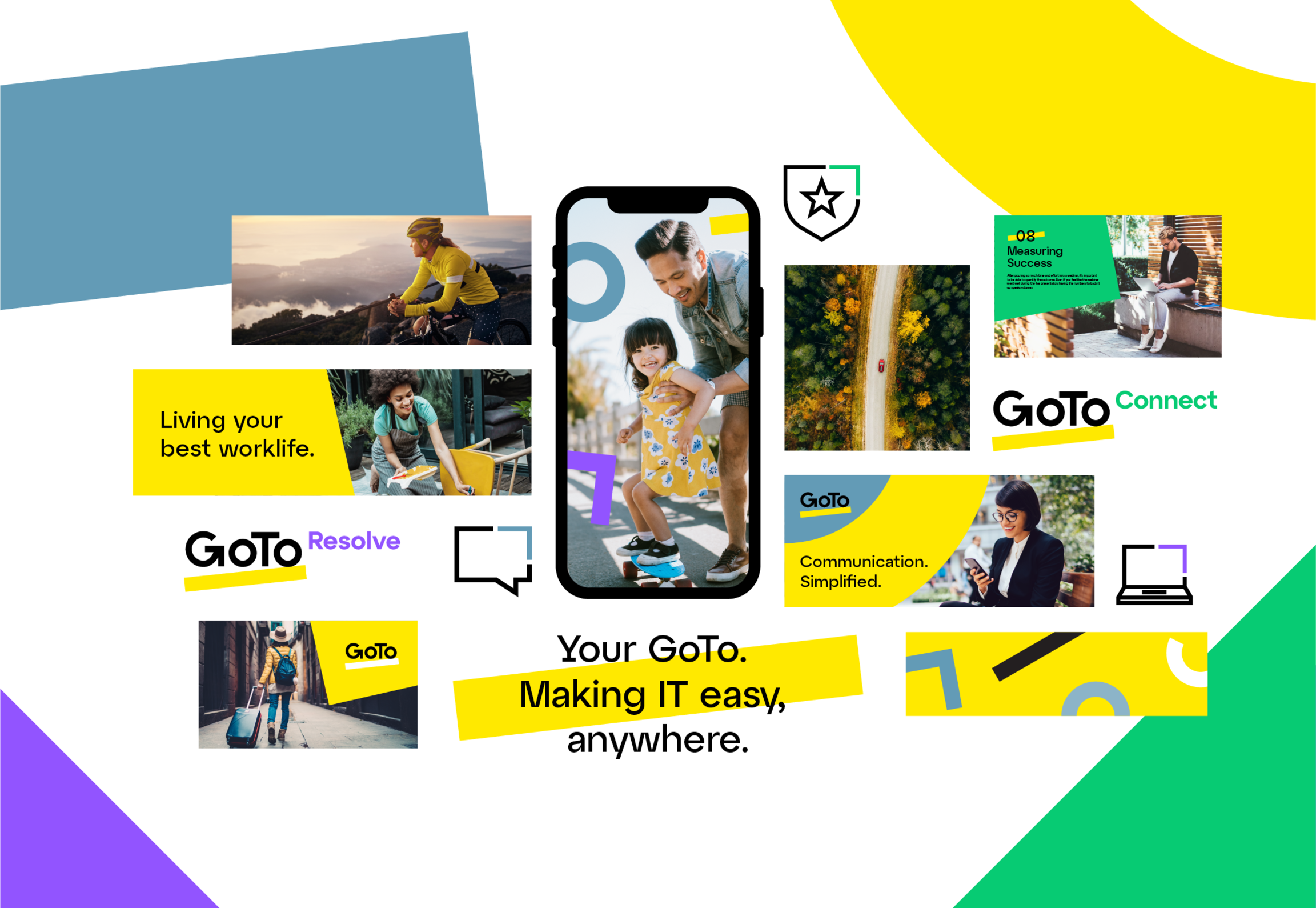
GoTo Rebrand
Partnering with Moving Brands to rebrand GoTo from LogMeIn, we reorganized and simplified our portfolio to create an iconic, flexible brand identity, enhance customer experiences, and drive international business growth. The rebrand achieved a 15% increase in brand awareness.
My artistic vision left a lasting imprint on GoTo’s visual identity. I collaborated across multiple teams to integrate my artwork and direction with broader marketing strategies to achieve the overall rebrand, consistently exceeding expectations through my innovation and creativity. The foundation established during my time continues to drive GoTo’s ongoing growth and success.
Role
Art Director & Senior Designer
Credits
Patrick Hnath, Executive Creative Director
Thomas Mills, Creative Director
Bryn Emery, Senior Designer
Kell Schneider, Designer
Victor Hanas, Designer
Creative Platform Development
As a member of the Brand + Creative team, I expanded, developed, and implemented GoTo’s new brand identity. Our final digital brand guidelines can be viewed in detail here.
We pressure tested the design system and guidelines, identifying design issues, challenges, and gaps. We allowed our designers time with the system prior to creating real assets in order to learn and better understand the components and rules. We wantedeveryone involved and encouraged true exploration (no idea was a bad idea). We paused, assessed, and listened to feedback. We worked across all types of assets – internal, social, collateral, demand-generation, infographics, iconography, etc. Ultimately, the platform shined. It was flexible, scalable, and the new primary brand color – yellow – made us stand out in a sea of blue.

Iconography
Moving Brands established a unique iconography style, but it was up to our team to develop and implement it. Under my direction, designers created dozens of custom new icons as needs arose – anything from checkmarks and documents, to cameras, to bikes and mountains. You name it, we probably had an icon for it.
These aren’t your average monoline icons. We needed to be creative with our solutions to incorporate the pixel grid, sharp corners, and open gaps. All icons feature the chevron graphic element in the top right, reinforcing the idea of momentum. When the icon is used in the context of a product the "up and to the right" chevron aligns to the product color. That level of attention to detail sets my work apart.
Natasha, I don't know where to start other than to say thank you! It's been a long road to the rebrand for many, but your impact on our team throughout the whole process has been immense. You're greatly appreciated by those around you, and there is no way our team would have achieved what we did without you. The rebrand is a great achievement for us all. Thank you for bringing it EVERY SINGLE DAY!
– Tom Mills, Associate Creative DirectorPhotography Library
Photography brings the warmth of an emotional connection to our brand experience. The photography library we built out communicates GoTo’s core story, behaviors, and positioning. It differentiates the GoTo brand from competitors and creates a strong link with consumers.
The ‘fun’ photography shows people enjoying their lives outside of work, representing a diverse customer base. The ‘workplace’ photography captures people at work using GoTo’s products, with happy models, interacting with each other and/or devices naturally.
But what really makes GoTo’s photography library unique was curating images that featured our brand yellow. This was achieved by image selection, or adjusting in post-production. These small but subtle details helped build brand equity in the brand palette and reinforce the brand language.
Thank you for your hard work and support through our transformation to GoTo. The entire Marketing organization should be extremely proud of what we achieved. I can’t wait to see what we – the Greatest of all Teams – accomplish next!
– Jamie Domenici, Chief Marketing Officer, Klaviyo Our New Simplified Portfolio
Once we had launched GoTo, it was imperative to communicate the brand story, positioning statement, tone of voice, products, etc. A full summary of execution can be seen in the example sales and marketing tool below.


